
TL;DR:
UX and localization must be integrated to create truly native user experiences globally.
Effective localization involves adapting layout, visuals, and microcopy to cultural and regional differences.
Collaboration between UX and localization teams prevents costly errors and ensures successful global launches.
Most product teams assume localization is a late-stage task: swap the strings, ship the build, done. That assumption is quietly killing global launches. The real challenge isn’t finding the right words in another language. It’s making sure every interaction, every button, every visual cue feels native to your users, wherever they are. UX and localization are inseparable forces, and the teams that treat them as one unified discipline consistently outperform those that don’t. This guide breaks down what UX-driven localization actually looks like, where most teams go wrong, and how to build a process that turns global releases into genuine competitive advantages.
Key Takeaways
Point | Details |
|---|---|
UX goes beyond words | True localization adapts visuals, structure, and interactions for each market. |
Challenges need solutions | Addressing design edge cases prevents user frustration and increases adoption. |
Collaboration is critical | Integrated UX and localization teams ship better and faster to global users. |
Cultural nuance drives growth | Respecting norms and taboos can make or break success in new markets. |
What is UX in the context of localization?
Most people hear “localization” and picture a spreadsheet full of translated strings. That mental model is outdated and dangerously incomplete. True localization means adapting every layer of your product so that users in a new market experience it as if it were built specifically for them. That’s where UX becomes the backbone of the entire effort.
UX localization adapts UI/UX beyond translation to cultural, linguistic, and regional needs, including layouts, fonts, icons, colors, and UX writing for a native feel. In practice, this means a Japanese user shouldn’t feel like they’re using an American product with Japanese text pasted on top. The spacing, the information density, the visual hierarchy, all of it needs to reflect local expectations.
Understanding how UX shapes localization reveals that the relationship runs deeper than most teams realize. A button that works perfectly in English might break the layout in German, where words are notoriously longer. An icon that signals “success” in one culture might carry a completely different meaning in another. These aren’t edge cases. They’re the everyday reality of building for global audiences.
Holistic UX localization covers a wide range of elements that go well beyond swapping text:
Layout and spacing: Adapting grid structures to accommodate text expansion or contraction
Typography and fonts: Selecting typefaces that render correctly for scripts like Arabic, Devanagari, or CJK characters
Color and iconography: Ensuring visual elements don’t carry unintended cultural meanings
UX writing and microcopy: Crafting error messages, tooltips, and CTAs that feel natural and conversational in each language
Navigation patterns: Mirroring interfaces for right-to-left (RTL) languages like Arabic and Hebrew
Local formats: Dates, currencies, phone numbers, and address fields that match regional conventions
You can explore UI-UX adaptation examples to see how these principles play out across real products. The takeaway is clear: UX localization isn’t a cosmetic fix. It’s a structural rethink of how your product communicates with each audience.
“Localization is not about translating words. It’s about translating the entire experience.”
When your UX team and localization team operate with this shared understanding, the quality of your global product jumps dramatically. Without it, you’re just shipping confusion in multiple languages.
Why UX design is critical in localization success
Ignoring UX in your localization process doesn’t just create awkward interfaces. It actively drives users away. Studies consistently show that users abandon products that feel foreign or confusing, even when the language is technically correct. Poor localization signals a lack of respect for the user’s culture, and that perception is very hard to reverse.

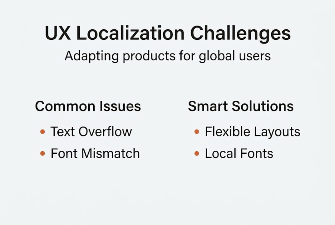
The edge cases in localization are more common than you’d expect: text overflow and expansion, RTL mirroring for navigation and icons, cultural taboos embedded in imagery, variable information density preferences, and local payment or address formats. Each one is a potential drop-off point if left unaddressed.
Consider cultural nuance in UX as a business risk, not just a design concern. A checkout flow designed for Western linear reading patterns can feel disorienting to users accustomed to different visual hierarchies. A color chosen for its brand energy in one market might signal danger or mourning in another.
Localization failure | UX-driven success |
|---|---|
Text overflow breaks button layout | Flexible UI components handle expansion |
RTL language shows mirrored navigation errors | Full RTL mirroring tested before launch |
Icon misread as offensive in target culture | Icons validated with local user research |
Date format confuses users (MM/DD vs DD/MM) | Format auto-detects based on locale |
Payment form missing local methods | Locale-specific payment fields integrated |
The business case is straightforward. Products that invest in UX-driven localization see higher adoption rates, stronger retention, and better word-of-mouth in new markets. Products that skip it often face costly redesigns, negative reviews, and slow market penetration.
Pro Tip: Involve native users in usability testing before your localized product goes live. Translators can catch linguistic errors, but only real users in the target market will reveal whether the experience actually feels right. Even a small round of five to eight user interviews can surface critical UX issues that no amount of internal review would catch.
The stakes are high, but so is the opportunity. Teams that treat UX as a core pillar of localization build products that genuinely resonate, and that resonance translates directly into market share.
Common UX challenges in localization and how to solve them
Knowing the risks is one thing. Having a repeatable process to tackle them is another. The most frequent UX challenges in localization follow predictable patterns, which means you can build systematic solutions rather than firefighting each one.
Text expansion, RTL mirroring, cultural taboos, information density variance, and local formats are the major edge cases that trip up even experienced global teams. Here’s how to approach each one with a structured mindset:
Audit your UI for text expansion risk. German and Finnish can expand English text by 30 to 40 percent. Run pseudo-localization tests early in the design phase to identify components that will break. Fix the layout logic before translation even begins.
Build RTL support into your design system from day one. Don’t treat RTL as an afterthought. Use logical CSS properties (start/end instead of left/right) and test navigation, icon placement, and reading flow with native RTL speakers.
Conduct a cultural audit of your iconography and color palette. What does your thumbs-up icon mean in the target market? What does your brand’s primary color communicate locally? Bring in local cultural consultants, not just translators, to review visual elements.
Map local format requirements before building forms. Date formats, phone number structures, postal codes, and payment fields vary significantly by region. Build locale-aware form components that adapt automatically rather than requiring manual overrides.
Test information density with local users. Some markets, particularly in East Asia, prefer higher information density on screen. Others expect more whitespace and minimalism. Your default layout may feel either overwhelming or sparse to new audiences.
For deeper guidance on solving localization challenges and applying localization best practices, the key principle is the same: solve structurally, not superficially.
Pro Tip: Always validate with local experts who understand both the language and the culture, not just professional translators. A linguist can confirm your text is grammatically correct. A local UX expert will tell you whether the experience actually makes sense to someone living in that market.
Building these steps into your standard release checklist transforms localization from a reactive scramble into a proactive, quality-driven process.
Integrating UX and localization teams for effective global launches
The most technically sound localization can still fail if your UX and localization teams are working in separate silos. When these two disciplines operate in parallel but independently, you get faster timelines and fewer costly surprises. When they’re siloed, you get last-minute redesigns, misaligned copy, and cultural missteps that slip through review.
Localization adapts UX design at every layer, from structure to microcopy, colors, icons, and cultural norms. That scope of work demands genuine collaboration, not just handoffs.
Review best practices for global teams and you’ll notice a consistent pattern: the highest-performing localization programs treat UX designers and localization specialists as co-owners of the user experience, not sequential contributors.
Siloed workflow | Integrated workflow |
|---|---|
UX designs in English, localization adapts later | UX designs with localization constraints built in |
Translation delivered at end of sprint | Translators involved from wireframe stage |
Cultural review happens post-launch | Cultural audit runs alongside design review |
Bugs found during QA require redesign | Issues caught early with minimal rework |
You can also explore UI/UX design processes that show how integrated teams structure their workflows for global-first products. The efficiency gains are real and measurable.
Here are practical tips for building cross-functional alignment between UX and localization:
Create shared localization briefs that include brand voice guidelines, cultural sensitivities, and design constraints for each target market
Use shared tooling so designers and translators work in the same environment, reducing handoff friction and version control issues
Schedule joint review sessions where UX designers and localization specialists review mockups together before development begins
Establish a glossary of approved terms and UI patterns for each locale, preventing inconsistency across features
Run combined user testing with native speakers who evaluate both the language quality and the overall UX feel
When UX and localization teams share goals, tools, and timelines, global launches stop feeling like controlled chaos and start feeling like a repeatable, scalable capability.
A fresh perspective: Why real UX localization isn’t what most teams expect
Here’s the uncomfortable truth most localization guides won’t tell you: genuine UX localization requires giving up control. Not just over words, but over design decisions you spent months perfecting.
Most teams approach localization as a translation layer on top of a finished product. They protect the core design and ask translators to fit into it. That approach feels efficient, but it produces experiences that are technically localized and culturally hollow. Users in new markets can feel the difference immediately.
Real UX localization means accepting that your pixel-perfect vision might need to crumble a little. A layout that feels elegant in English might need to be completely restructured for a market that reads right to left or prefers denser information presentation. That’s not a failure of your original design. It’s the design doing its job in a new context.
The teams that build truly beyond translation in localization experiences are the ones willing to iterate based on local feedback, even when it challenges their assumptions. They treat personalization in localization as a creative opportunity, not a compliance task. Discomfort and iteration aren’t signs that something went wrong. They’re signs that you’re doing it right.
Take the next step in UX-powered localization
You now have a clear picture of what separates surface-level localization from the kind that actually drives global growth. The next step is putting that knowledge into a workflow your entire team can use consistently.
Gleef is built exactly for this moment. The Gleef localization platform connects your UX designers, product managers, and localization specialists in one seamless environment, powered by AI that understands context, not just words. With the AI localization in Figma plugin, your team can manage translations directly inside your design files, catching layout issues and cultural mismatches before a single line of code is written. Faster releases, fewer surprises, and experiences that feel native everywhere you launch.
Frequently asked questions
What are the most common UX localization mistakes?
Relying only on text translation, ignoring layout changes, and missing cultural taboos and format issues are among the top mistakes teams make when entering new markets.
How does good UX improve product adoption in new markets?
UX localization beyond translation makes users feel at home in your product, which directly increases satisfaction, retention, and organic referrals in that market.
What are examples of UX elements that require localization?
Text length, button layout, icons, color associations, date formats, and payment fields all require localization, as formats, icons, and colors carry different meanings and functional requirements across regions.